
|
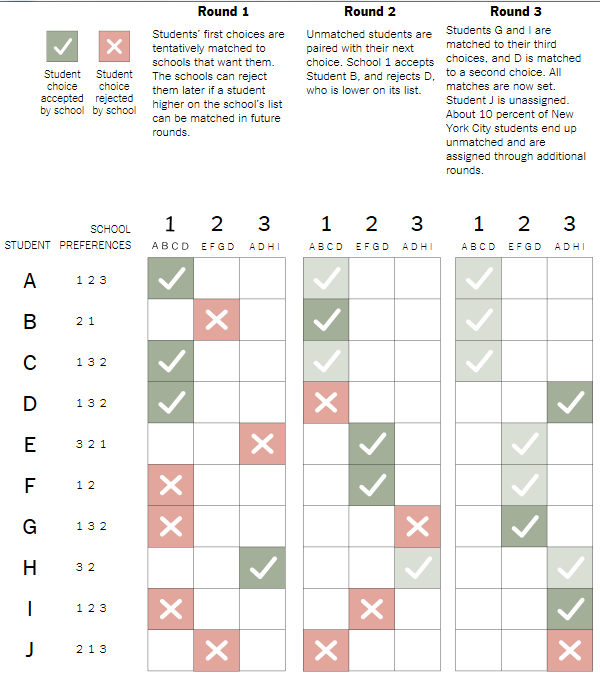
The NY Times neatly reported on the use of Nobel Prize winning gaming theory in the perennial problem of matching New York's high school students with the school of their choice. Since all 75,000 NYC Middle-school students have the option of attending any of the 426 NYC schools and there are many over-achievers, a simple priority list like the college acceptance process used to result in many unhappy applicants. So a group of professors got together and modified a gaming theory called "The Stable Marriage" for this purpose. In the early 1960s, the economists David Gale and Lloyd Shapley proved that it was theoretically possible to pair an unlimited number of men and women in stable marriages according to their preferences. By running a series of rounds of proposals and acceptances with tentative acceptance sometimes being trumped by a rejection and acceptance of another suitor, all the men and women get matched up with someone within their range of preferences. Below is a nice graphic showing the process simplified to ten students, three schools, each of which have three slots, three preferences and three rounds. In reality there are more of each variable but, with computerization, the process works the same. In 2003, New York City changed its method for matching eighth graders to high schools with a system, called a deferred acceptance algorithm, that was designed by a team of professors, including one who later won a Nobel prize in economic science. The key feature was mutuality: Students submit a list of preferred schools in order, and schools prepare an ordered list of students whom they want or who meet their standards. After rounds of computer matching, schools and students are paired so that students get their highest-ranked school that also wants them. Here, in simplified form, is how it works. In this example, each school can take three students, although it can list more, and each student can list up to three choices.
|
| Sources: Academic papers, with assistance from Parag Pathak, Massachusetts Insitute of Technology
By Ford Fessenden |
Election Graphics
The New York Times did a great job with a lot of data, showing the swings from Democrat to Republican in the House and Senate over the years from 1944 to this last election. With a very simple graphic and a few words, they show the weight towards Democratic and the shifts over the years as representatives clutched on presidential coat-tails or were ousted as their presidents lost popularity. I'll let the graphs speak for themselves below:

Quarterback Graphic
The New York Times graphic department scored with this beautiful graphic showing touchdown passes plotted against year for 252 quarterbacks.
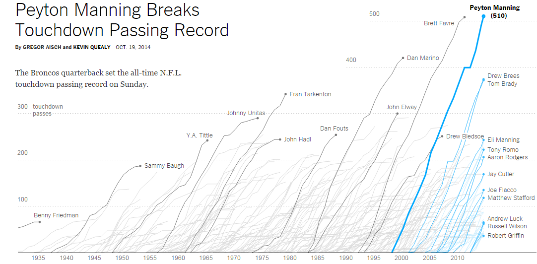
With 252 quarterbacks and their touchdown passes shown each year of their career, this stunning graphic has over 2000 pieces of data elegantly displayed. The top quarterbacks and the current crop have their curves labeled. By looking at the slope of the curve, one can see which quarterback is most efficient while the height shows the record holders. You can compare quarterback efficiency and production over the decades all the way back to Benny Friedman in the 1930's.
Get access to the full article here.
Nice graphic about incomes
The Times graphic department did another great job, showing a lot of data in a clever way. How have American's incomes increased (or decreased) over thirty years by percentile compared with other countries. I'll let the graphic speak for itself:

Pretty cool, huh. If you want to read the article, click here.
College football conference graphic
Here's another great graphic and one I want to post so I can have access to it when I need it. It shows the shifting conferences that college football teams have experienced lately. The picture is pretty small but this link gets you to the web page from the NY Times that allows you to interactively highlight any team and see where it went. great job Times!


Are US workers spending too much time on the job?
Far be it for me to recommend US workers emulate the French who work 30 hours a week and have annual 17 week vacations but perhaps we are working too hard. The following two graphs from a recent New York Times article put things into perspective for me.
Why are we one of only eight countries that don't offer paid maternity leave? Being in the same club as Suriname and Liberia doesn't speak well for this country.
 |
| Recent NY Times article |
And our work week hasn't dropped much along with the prosperity brought by the second half of the 20th century. Even the Japanese are working less than we are.
